PERSONAL STUDENT PROJECT 2024
Print Publication | PHOTOSHOP & INDESIGN
Fueling Curiosity
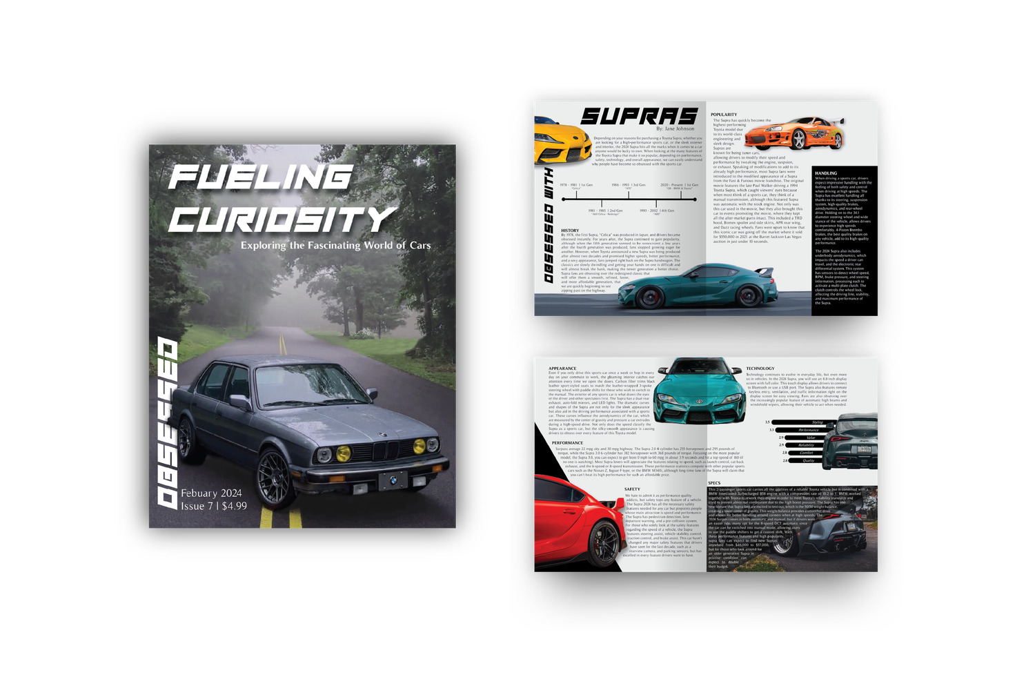
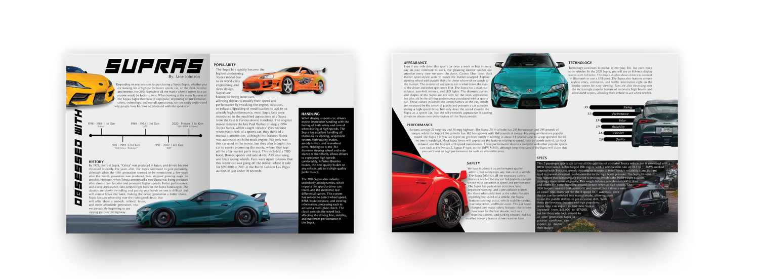
Coming from a family of car enthusiasts, I chose to create a two spread print magazine on Supras. I wanted to focus on the Supras history, performance, and specs, while combining text, images, graphics to create an engaging read for other car lovers.
Ideation
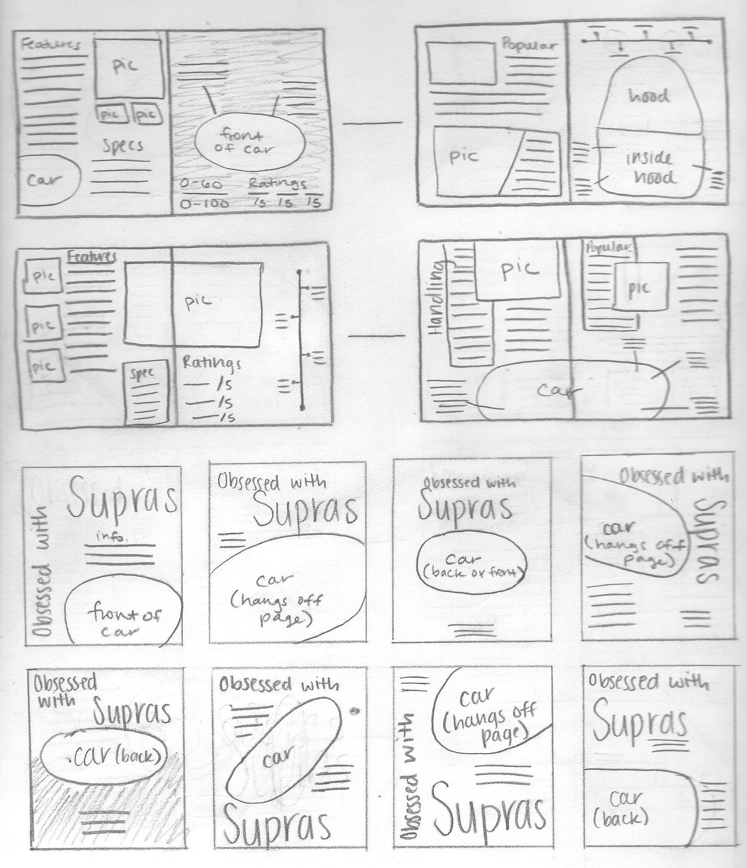
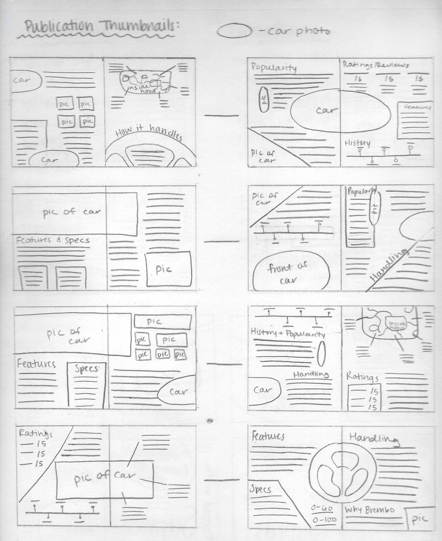
I started by creating a mood board from Pinterest showing different magazine spreads, magazine covers, images of cars, and layouts. I then began sketching various spread and cover layouts. I wanted to include several text wraps and a variety of supra images separating blocks of text and drawing the users eyes all around the page.
Layout
I chose a black-and-white color palette for the spreads so I could portray the high quality associated with sports cars. Pops of color would be shown through the various car images rather than on graphics and text.
I chose images that had been taken by myself or by friends so I could have a wide variety of models and colors. A few graphic charts and historical graphs were created to highlight more car specs or details in a condensed format.
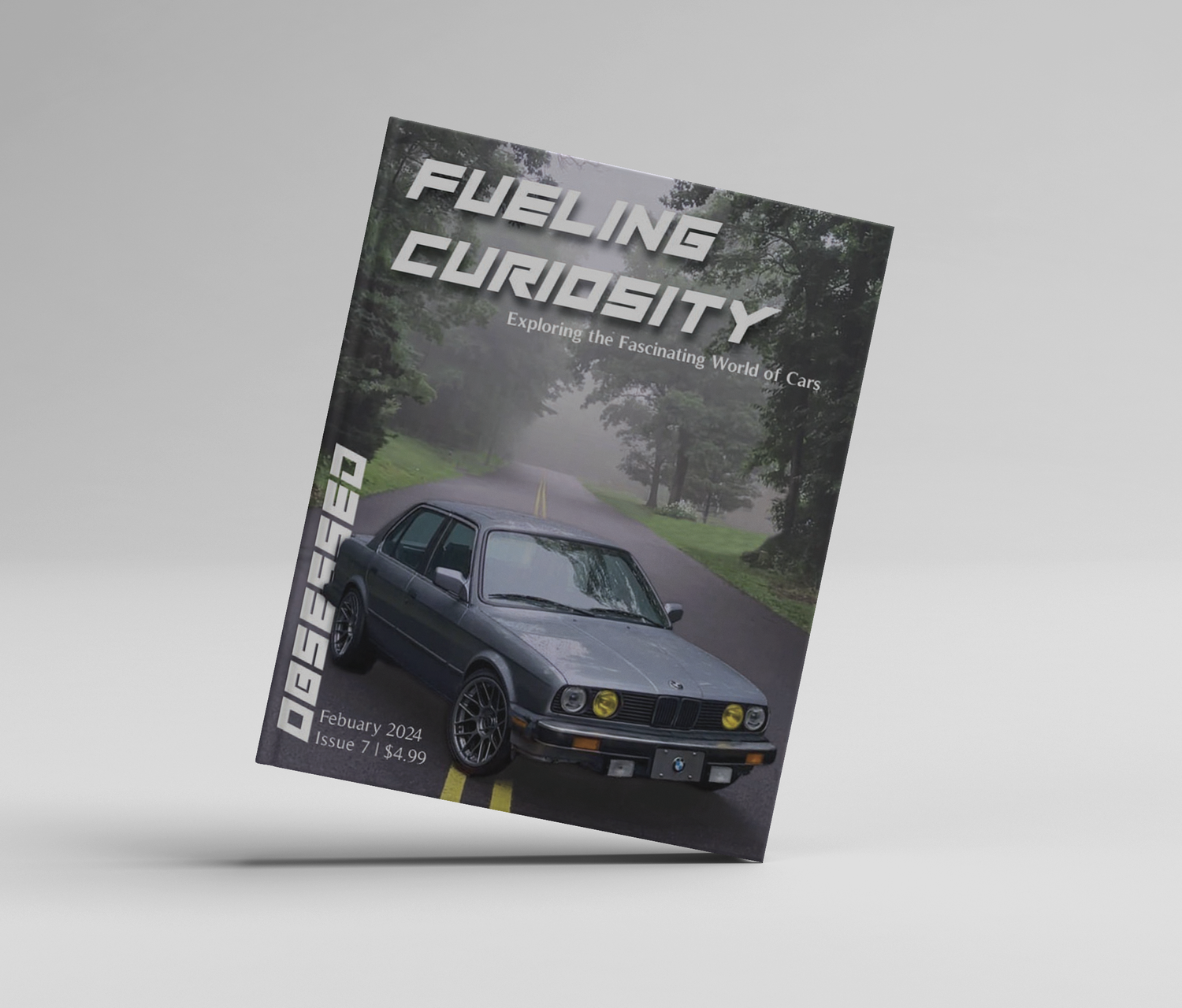
Presentation and Supporting Image Assets Designed by @macrovector, @wirestock, @qeaql-studio, @magnific / Magnific (www.magnific.com)
Header Font (Play Pretend) by Chequered Ink / Dafont (www.dafont.com)