PERSONAL STUDENT PROJECT 2023
app DESIGN | Illustrator & Adobe XD
ShutterScrub
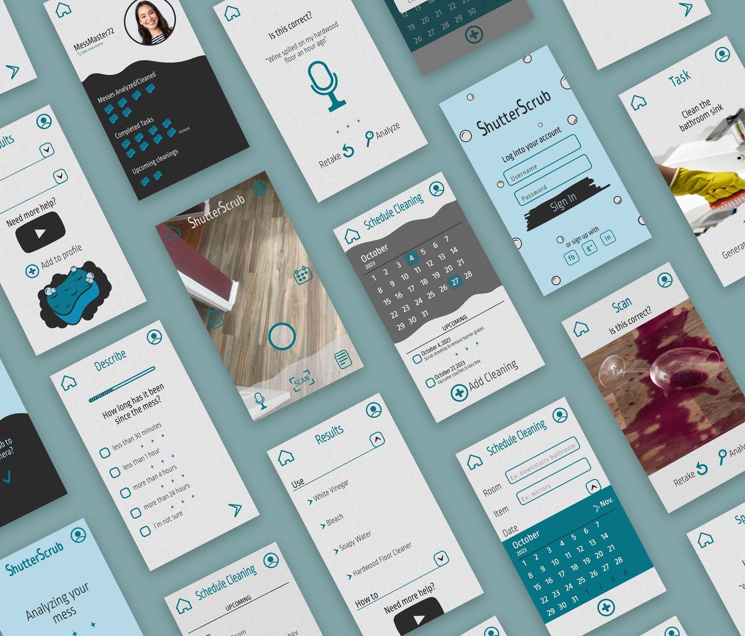
The goal of this project to create a mobile app prototype solving a problem users have in their daily lives. This was a team project, and we wanted to solve a problem many users have; not knowing how to clean up a mess, by using AI to recognize a photo scan, written subscription, and audio recognition. My part of this project included the brand matrix, sitemap, personas, icons, screens and the final mockup.
Brand Matrix & Sitemap
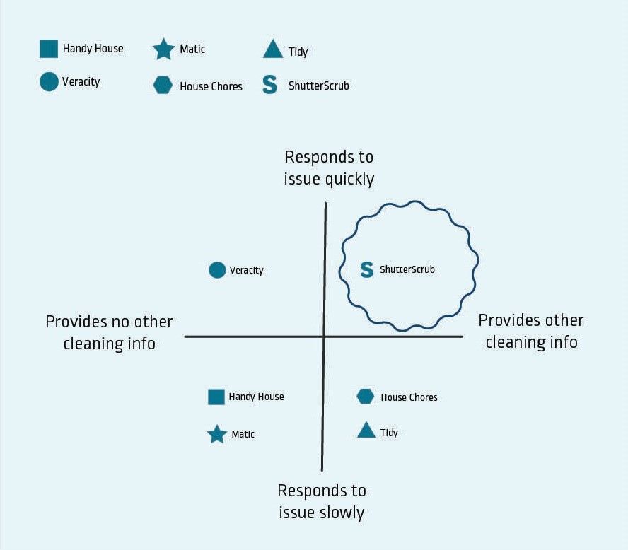
I used a brand matrix to compare different features of several cleaning apps. The comparable apps included Handy House, Matic, Veracity, House Chores, and Tidy. This helped determine what features our app, ShutterScrub, should have.
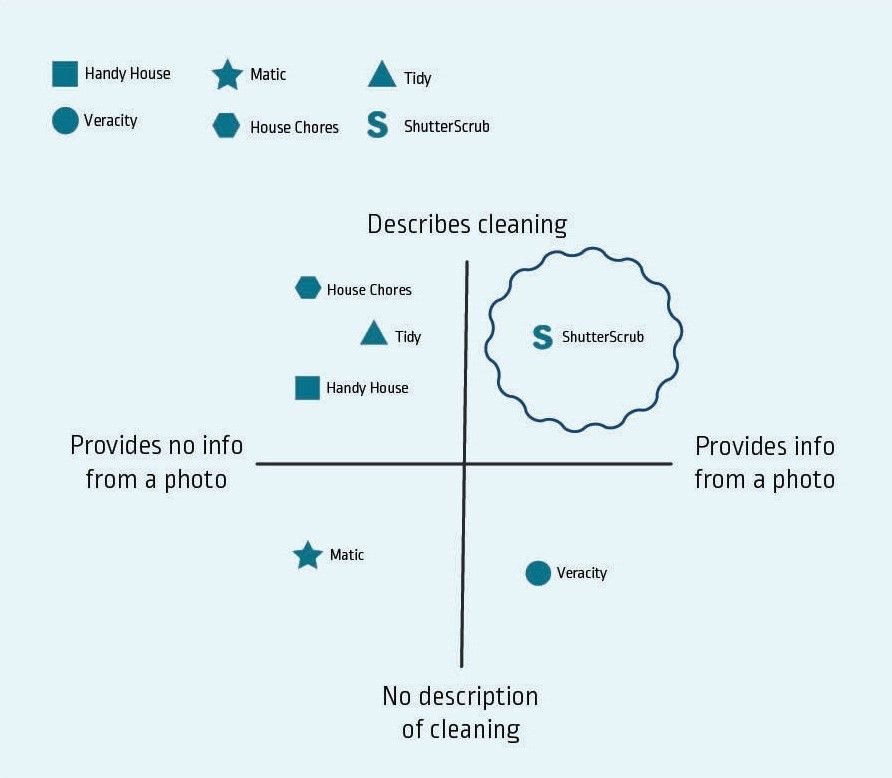
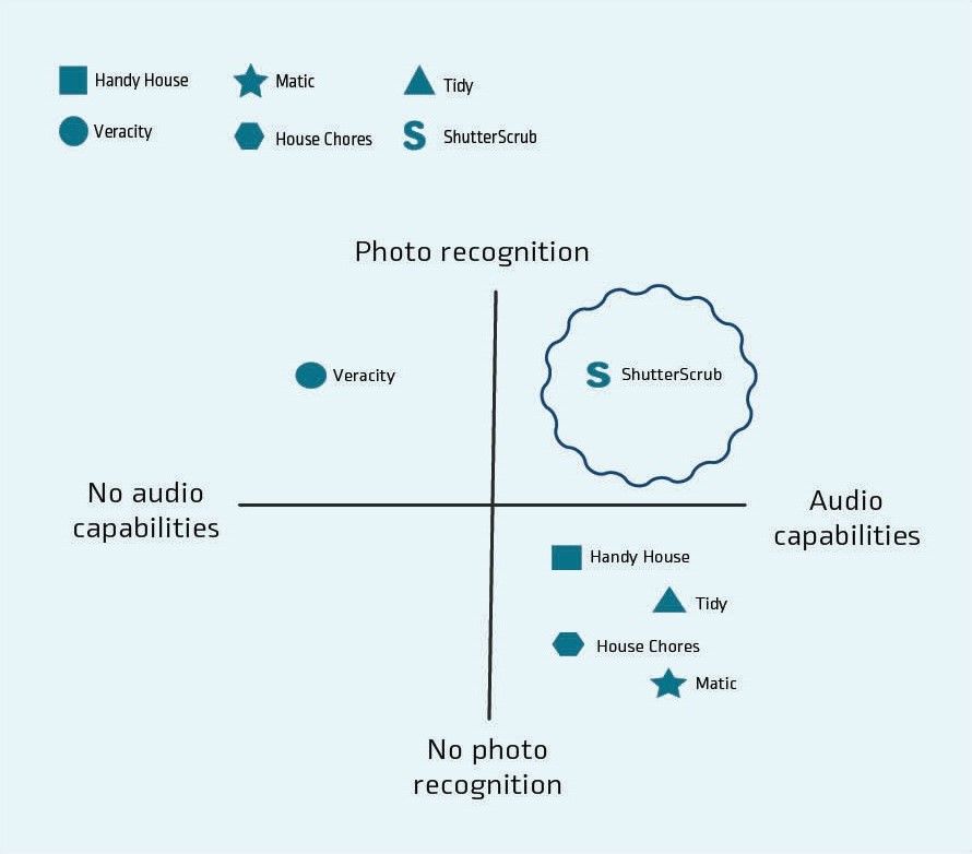
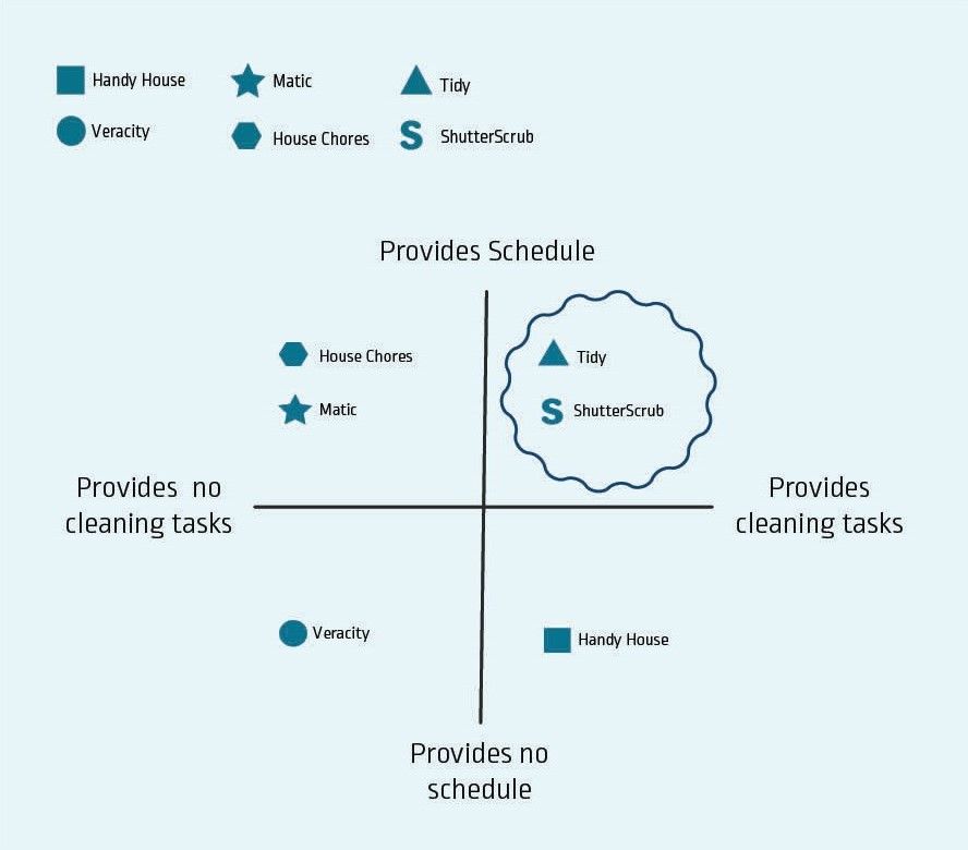
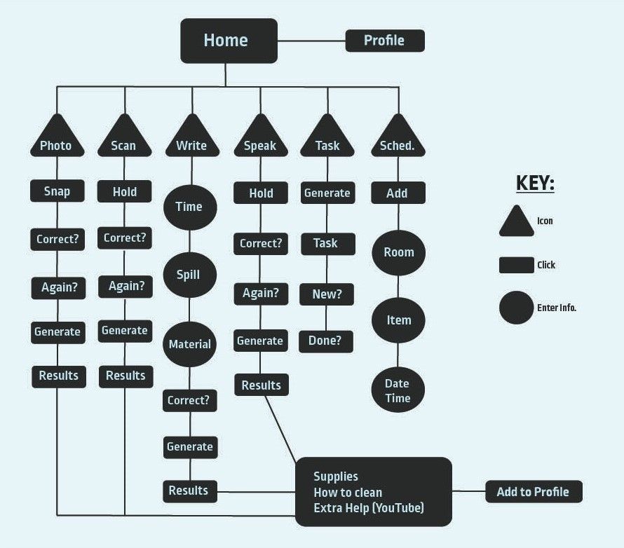
Based on the brand matrix, I created a sitemap of all the features that would be beneficial to include on our app, including a photo, scan, writing a description, and speaking options for cleaning help. As far as cleaning tasks, the user could generate a new cleaning task or schedule specific tasks.
Personas
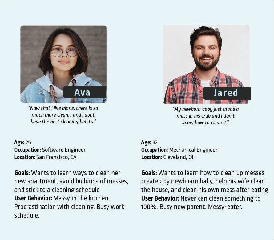
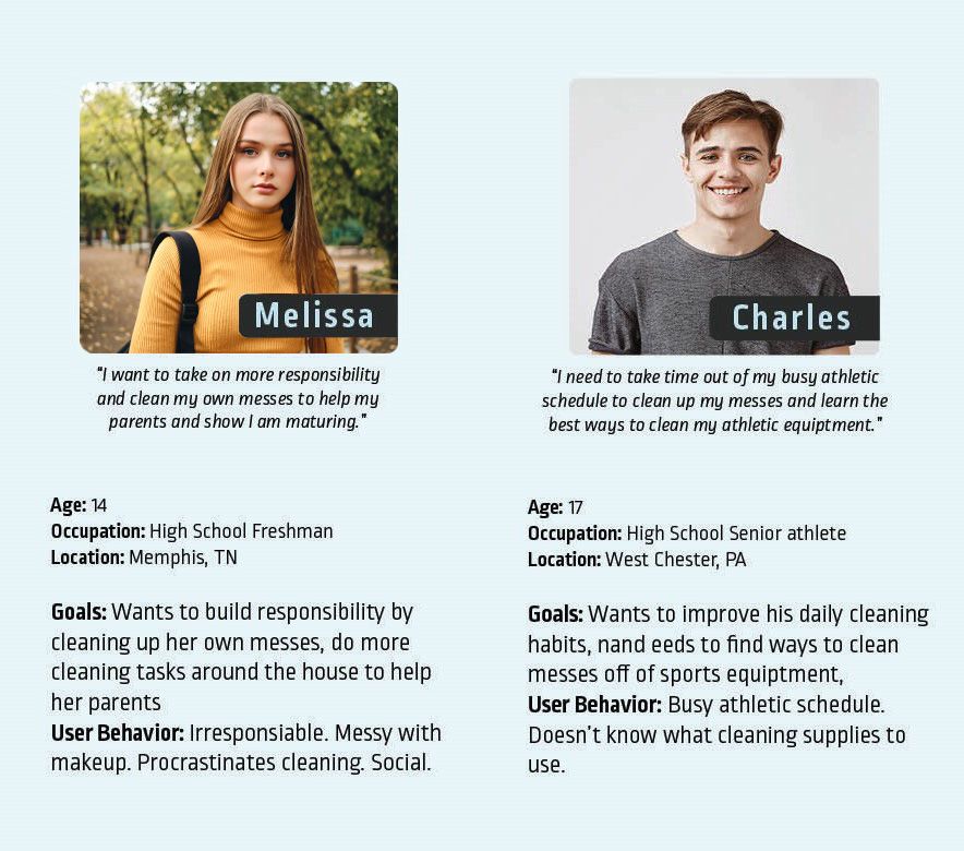
I first created a persona to gauge who our audience was and how they would benefit from this app. I found 4 users, ranging from high school students taking on more cleaning responsibility to young adults finding their way with living alone or with their families. This allowed us to see what features were necessary for each user and how they could benefit from the specific features of this app.
Layout
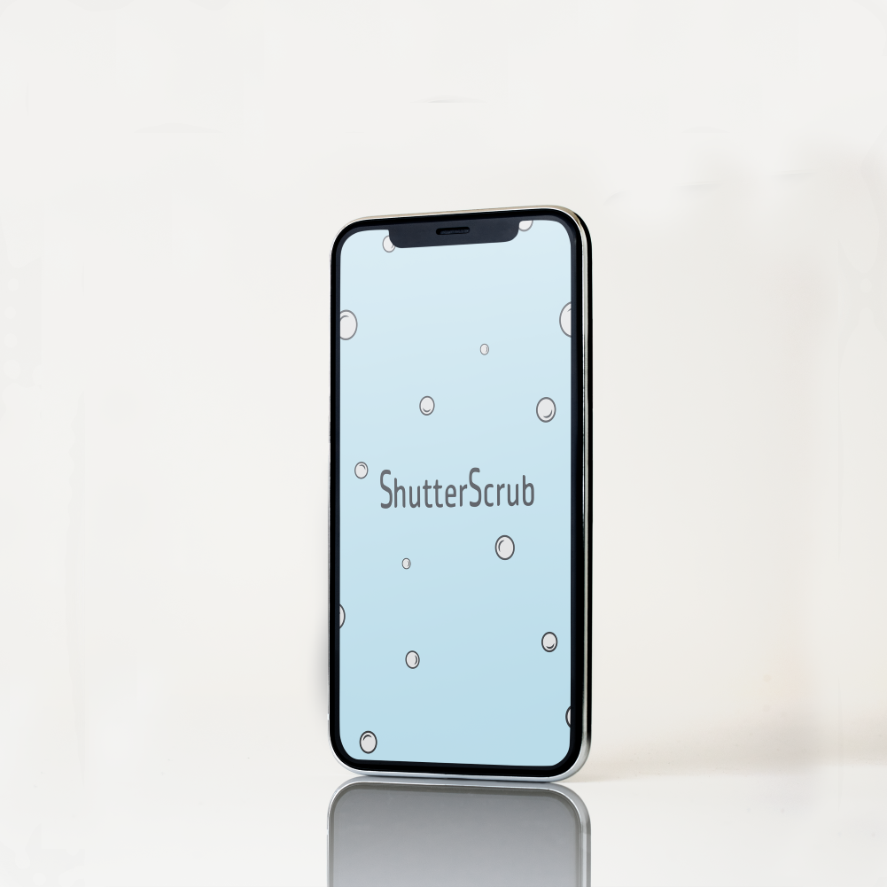
The entire team sketched icon variations highlighting cleaning aspects, the scan/photo feature, and using the app name, until we landed on a simple, recognizable letter icon that would be easily readable on a mobile device. I went with shades of blue since users associate blue with cleaning and a freshness. Making the sparkles in a very light blue gave enough contrast for the sparkles to be easily recognized on the phone's home screen.

App Screens
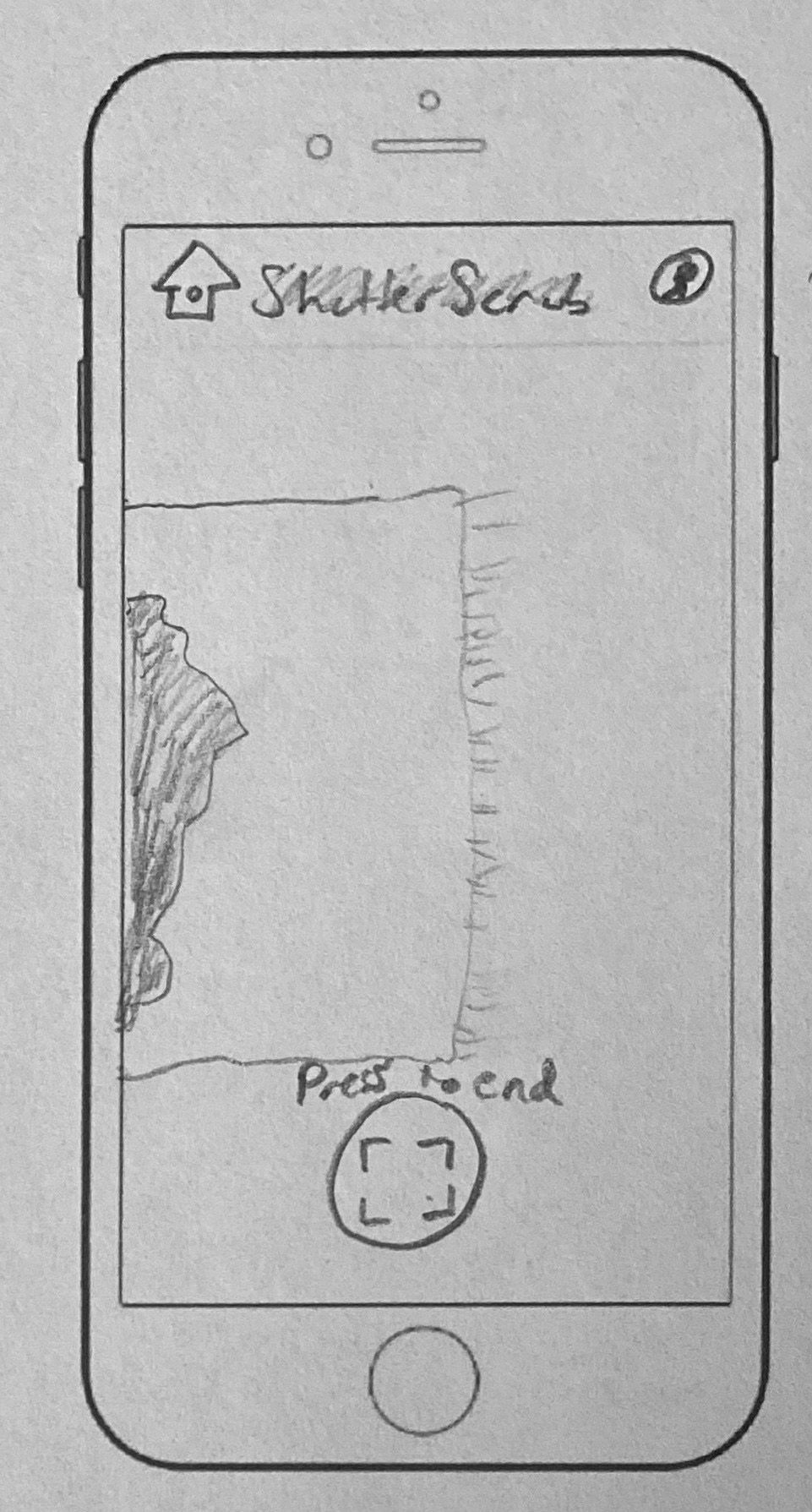
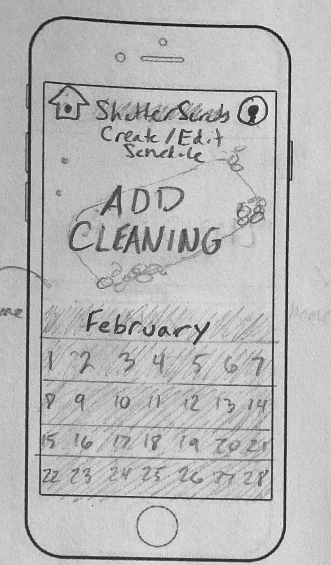
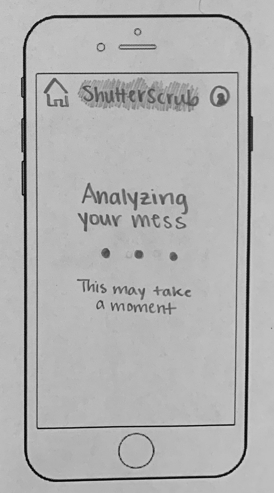
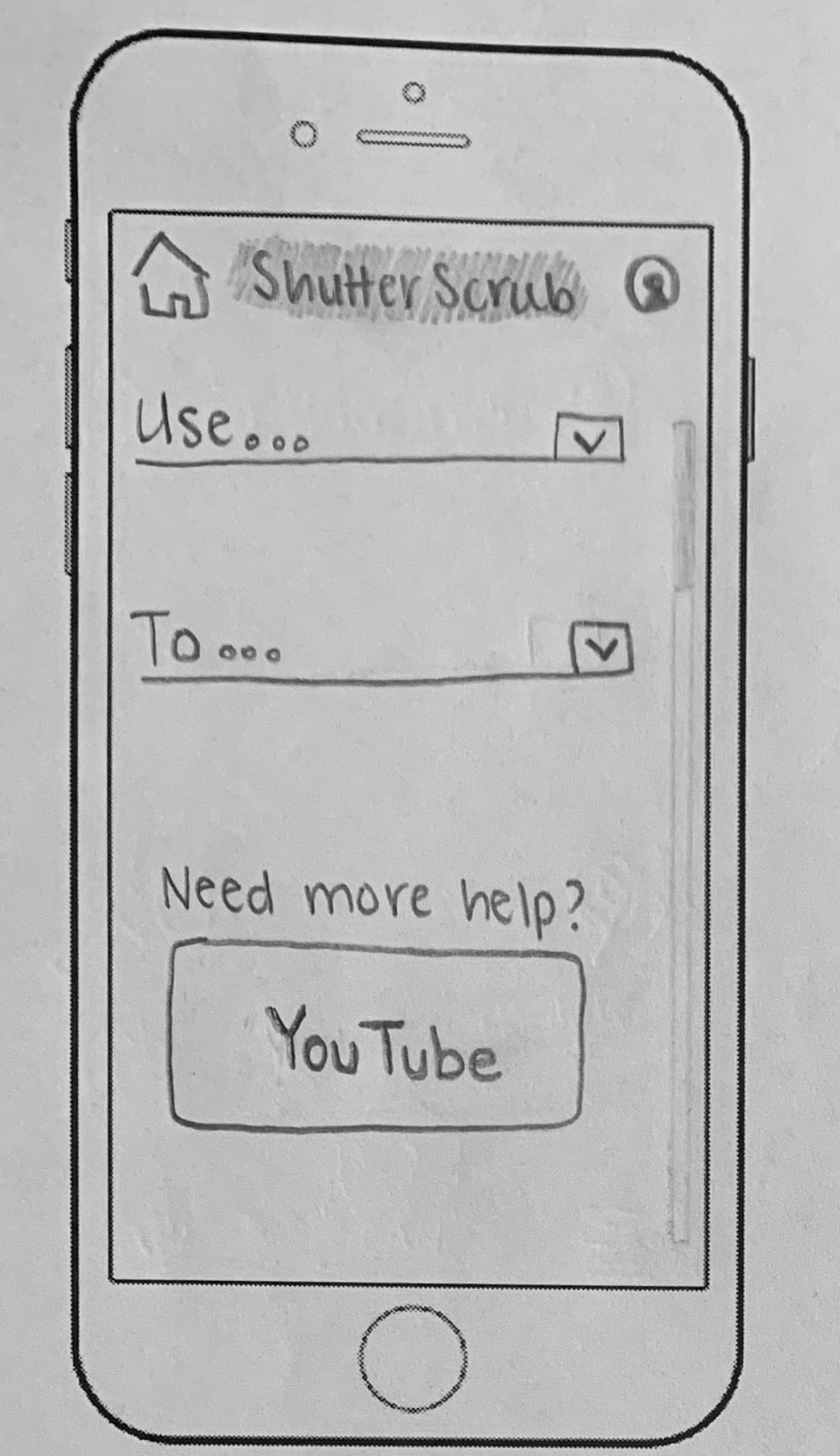
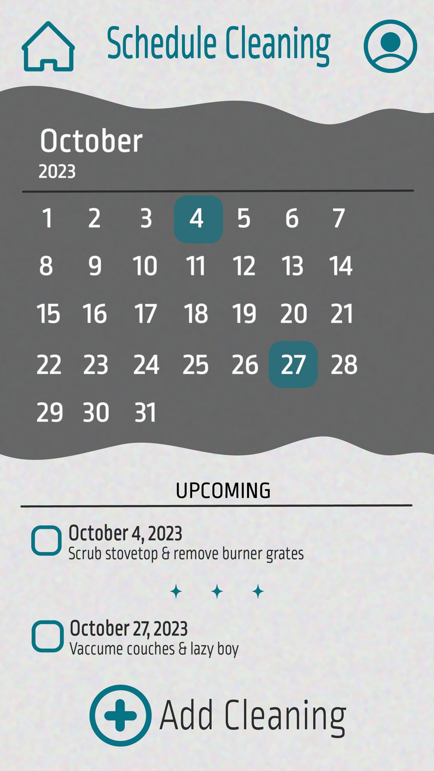
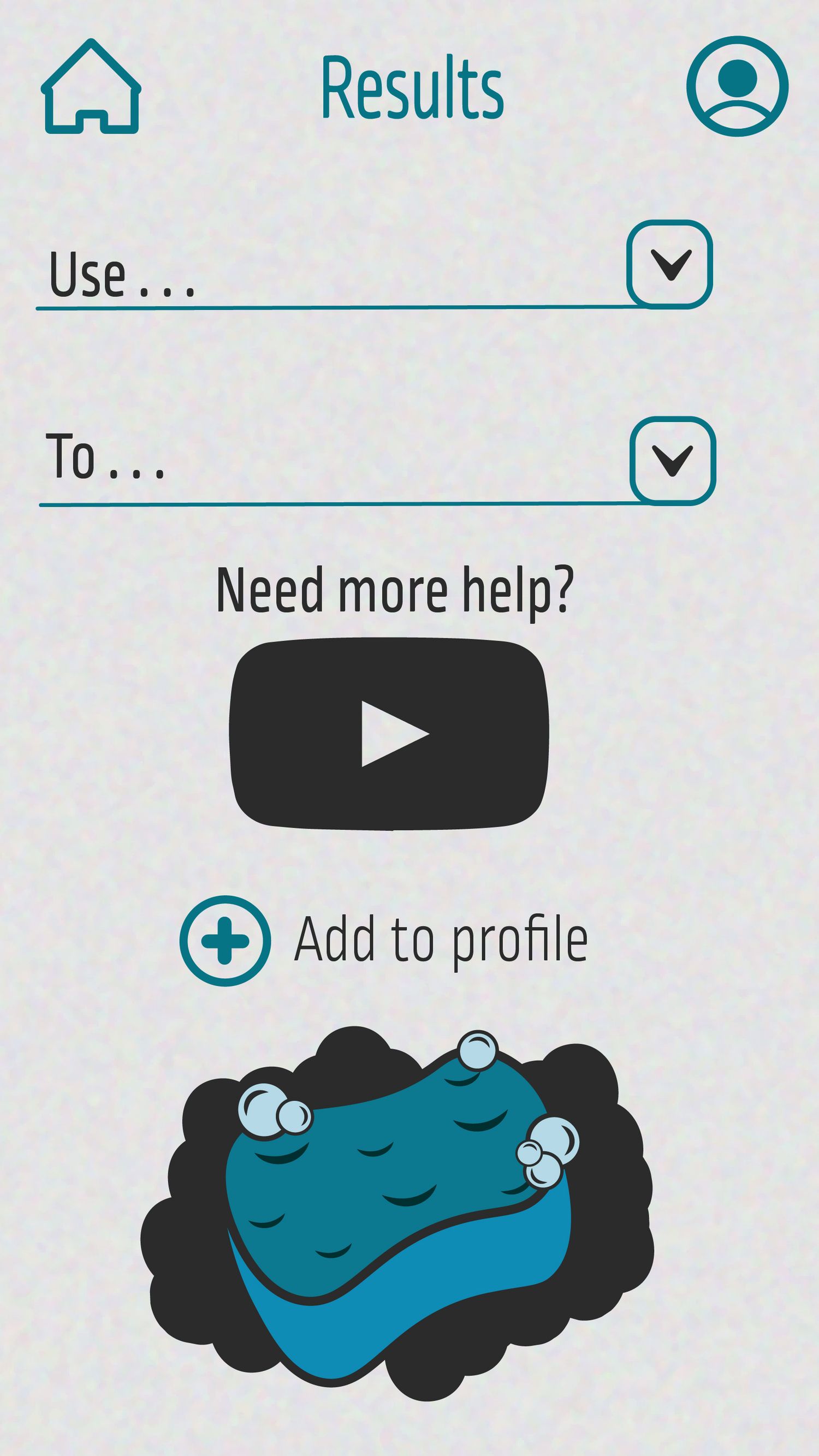
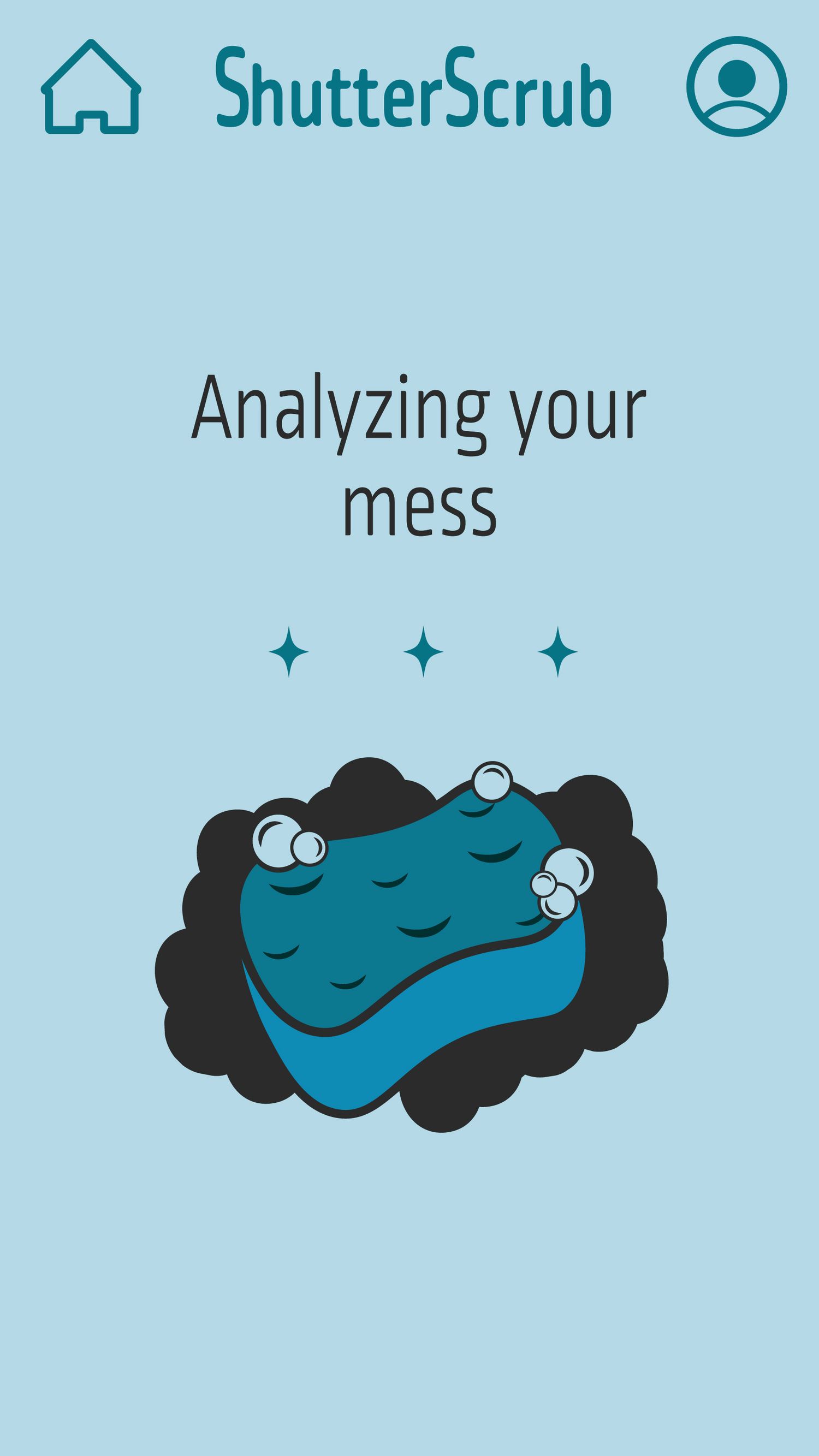
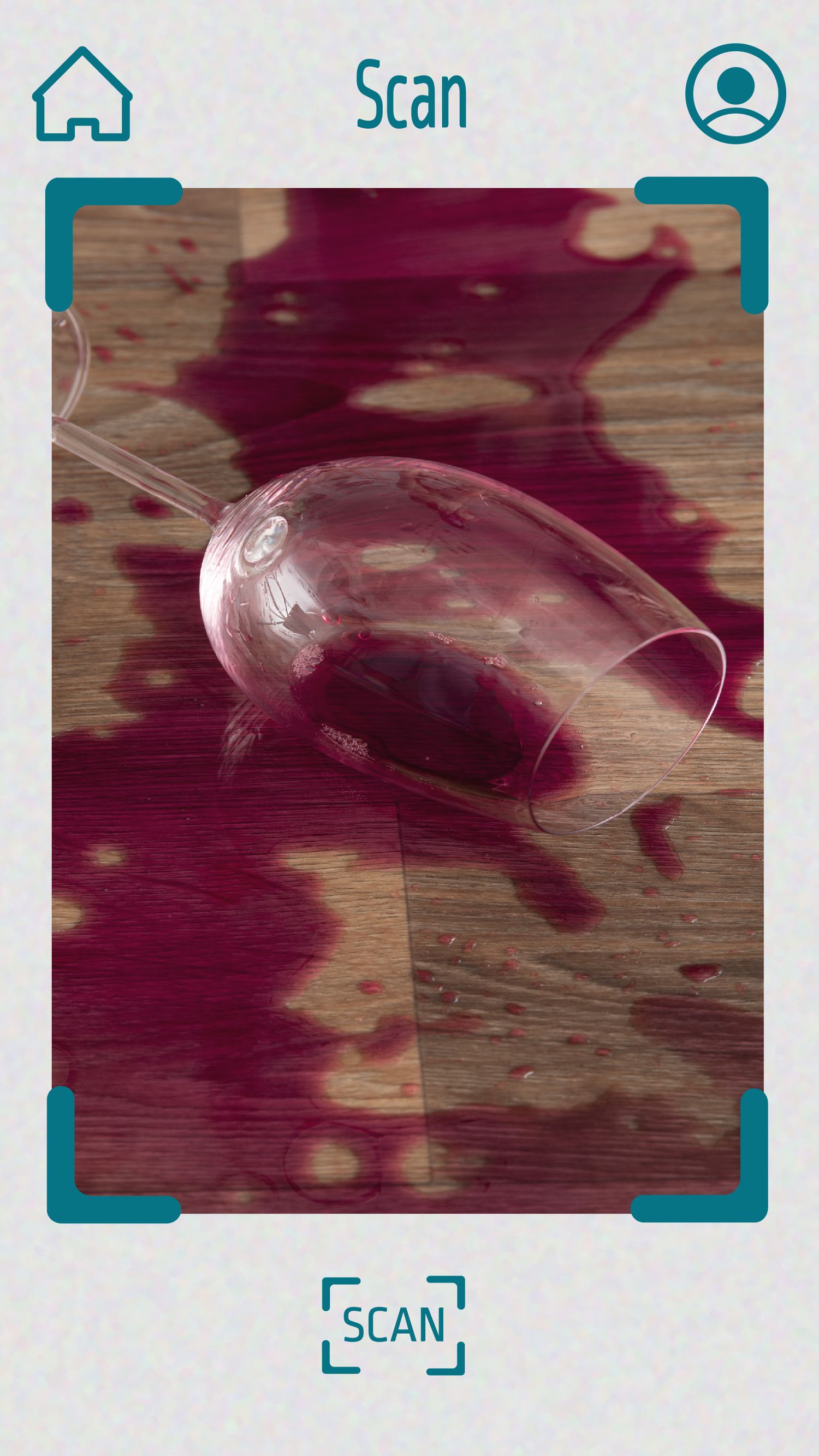
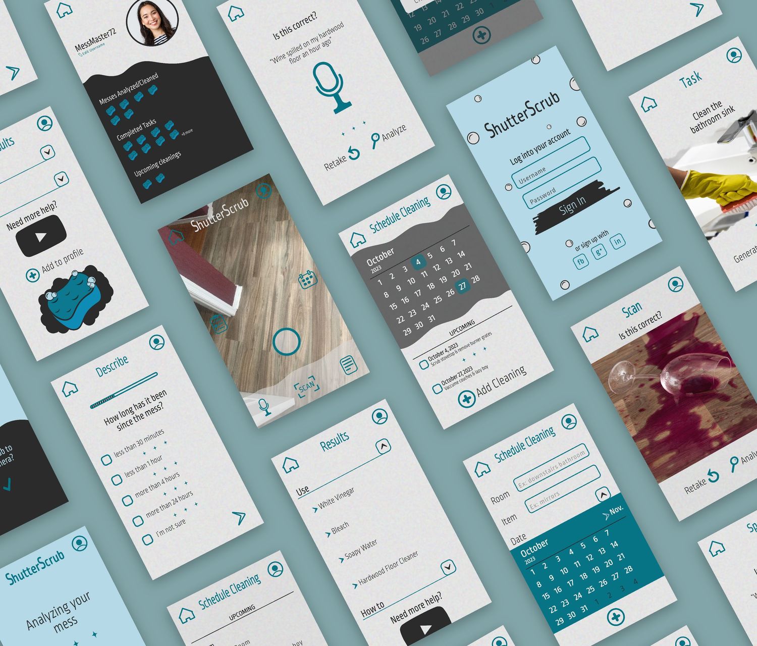
The UI screens were hand drawn in black and white first to create a low-fidelity wireframe of the app's main screens, like the scanning feature, mess analysis, cleaning directions, and the cleaning schedule calendar.
Final App Design Choices
We wanted to incorporate a large circle icon for the home screen to replicate the photo feature, since many users recognize this button from a phone camera or the popular app; Snapchat. The bottom navigation icons were kept together so the user would know the difference between recognizing a mess and adding a cleaning task to their calendar. The top of the app homepage stays static throughout every screen, holding the home icon, profile icon, and app name.
When creating the final screens, I used similar colors to the app icon to stay consistent. Keeping a simple, light gray, texted background for the main feature screens and analysis results, helped the user focus on the cleaning instructions rather than a heavy graphic screen, distracting from the urgent mess.
Presentation and Supporting Image Assets Designed by @benzoix, @rawpixel.com, @wayhomestudio, @lookstudio, @garetvisual, @cookie_studio, @user15285612, @magnific / Magnific (www.magnific.com)